Posted by & filed under Cowley Abbott Updates.

A founding member of the second group of “Les Plasticiens” in Montréal in 1955 and constantly innovative throughout his long career as a painter, poet, and university teacher, Guido Molinari was a prominent spokesperson for abstract art from the 1950s until the 2000s. There is no abstract painter in Canada who delved deeper into the profundities of the genre than Guido Molinari, which suggests why “Bi-sériel rose” is as vibrant and immediate now as when it was painted in the late 60s.

Guido Molinari Bi-sériel rose, 1968

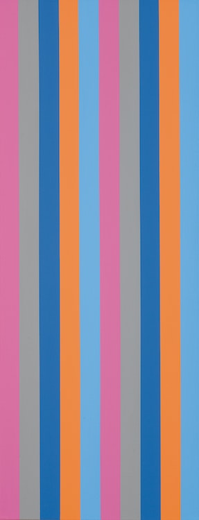
Molinari’s rigorously organized canvases require our close, even literal, attention. Both geometrically regular and chromatically complex, they work optically, corporeally, and intellectually. “Bi-sériel” rose clearly announces its key colour and organizing principle. We see two series of five colour bands; from left to right, rose, grey, darker blue, orange, and lighter blue. Because his individual colours work together (the orange and darker blue as complementary colours, for example), however, in addition to isolated stripes, they stand out as blocks in what remains a repeated sequence with variations. Individual colour columns repeat, but so do pairs of colours. The painting does not allow us to rest optically, nor does it have a stable centre (impossible with ten colour bars, unless one pairs two in the middle, as Molinari does here, leaving four symmetrical flanking columns on the left and right). Instead, our eyes and our bodies (because the painting is vertical and at a human viewer’s scale) are moved by the colour bands. We take part in a chromatic and intellectual game whose conventions are established by the painting. The game is complex but not infinite: the sequence is also clearly bounded by the fame, guaranteeing that the left edge (rose) differs from that at the right (light blue).

While “Bi-sériel rose” is primarily a painting to be taken on its own optical terms, Molinari‒akin to many abstract artists‒responded to the ambient world and encouraged his canvases to reverberate well beyond the frame. The sériels from this period, for example, were inspired by and closely cognate with his interests in the modern classical music of Schönberg and Webern.

We extend our thanks to Mark A. Cheetham, a freelance writer and curator and a professor of art history at the University of Toronto for contributing the preceding essay. He is author of “Abstract Art Against Autonomy: Infection, Resistance, and Cure since the ‘60s” (Cambridge University Press).

Posted by & filed under Cowley Abbott Updates.

According to the David Bowie expert Andy Peters: “This artwork is another ‘DHead’ of Trent Reznor and includes part of the lyrics written in David’s hand at the foot to NINs big hit ‘Hurt’ which is a unique selling point. This painting never existed in his original inventory of 66 official DHead paintings most of which were made commercially available and was instead part of the rumoured extra 40+ ‘nonpublished’ DHeads he had also created in the period between 1994 and 1997.”

In 1995 Nine Inch Nails opened for David Bowie on his Outside Tour, where he sang ‘Hurt’ with Trent Reznor. During their time spent on tour together in the 1990s, a close friendship was born that lasted until Bowie’s death in 2016. Most famously, they collaborated on ‘I’m Afraid of Americans’, a single from Bowie’s album Earthling.

We would like to thank Andy Peters at davidbowieautograph.com for his assistance with researching this artwork.

Posted by & filed under Cowley Abbott Updates.

Lawren Harris and A.Y. Jackson first painted on Lake Superior in October 1921. They took the Algoma Central Railway from Sand Lake, Algoma north to Franz, where they caught the Canadian Pacific train travelling west to Rossport and Schreiber. Harris would return to paint and draw on the north shore of Lake Superior almost every October until 1928. His Lake Superior canvases range from depictions of the rocks, hills and bays and interior lakes to dramatic visions of the light over the vast body of water.

Lawren Harris Quiet Lake (Northern Painting 12), circa 1926-1928

To better express his expanding vision of the landscape, in 1925 Harris began to paint on beaverboard panels that were approximately 12 x 15 inches (30.5 x 37.6 cm) rather than his earlier supports that measured approximately 10 1⁄2 x 13 1⁄2 inches (26.3 x 34.4 cm).
Harris frequently reinterpreted similar subjects, exploring in each work variant compositions in new pictorial languages. In May 1926 he presented a painting titled “Northern Lake” in the Group of Seven exhibition at the Art Gallery of Toronto. “Northern Lake” was worked up from a 12 x 15 inch oil sketch of 1925 now in the McMichael Canadian Art Collection (accession 1969.17.1). “Northern Lake” was one of the five Harris paintings included in the Canadian section of the Sesqui-Centennial exhibition in Philadelphia in the summer of 1926 (no. 1564, reproduced in the Philadelphia catalogue) where it was awarded a gold medal.

Jeremy Adamson, organizer of the major Harris retrospective at the Art Gallery of Ontario in 1978, has argued that the medal was awarded to Harris’ canvas “Ontario Hill Town” (University College, Toronto), not “Northern Lake”, though two reviews of the Annual Exhibition of Canadian Art at the National Gallery in Ottawa in January 1927, where “Northern Lake” was subsequently exhibited hors catalogue, confirm that “Northern Lake” was indeed the gold prize winner.

“Quiet Lake” is a similar composition to “Northern Lake” though clearly an evolution from the earlier canvas. The title “Quiet Lake”, a very a‒ characteristic title, was given to this painting when it was catalogued by Doris Mills, a friend of Harris’ wife Bess, in 1936. Mills listed it among a group of canvases she identified as Northern Paintings, of which this was number 12, not among Harris’ Lake Superior paintings.

However, the site is identified in a related sketch titled by the artist “Above Coldwell Bay, North Shore, Lake Superior” (sold Sotheby Parke Bernet (Canada), Toronto, 5 November 1979, lot 156). The lake depicted here was first painted by Harris prior to 1925, as there is an oil sketch of this same lake on a smaller panel (sold Sotheby’s Canada, Toronto, 3 December 1997, lot 155). However “Quiet Lake” was worked up from a panel of 1925 measuring 12 x 15 inches and titled by the artist “Northern Lake, Ontario, October”.

In both “Quiet Lake” and “Northern Lake” the point of view is determined by the foreground ‘ledge’. The lake opens up in the middle distance and is framed by the curves of the surrounding hills. In “Northern Lake” the hills rise left and right with the cold blue light of the sky glowing in the centre distance, reflecting on the water and casting shadows on the still lake. As Bertram Brooker wrote, the painting is “sombre, but none the less restful. In that sketch the distant rise upper left is painted in contrasting striations as on the hill upper right, whereas in the canvas “Quiet Lake” the yellow covers the entire slope.

There are similarities and differences between “Northern Lake” and “Quiet Lake”. In “Quiet Lake” Harris heightened the tonal contrasts, painting the autumn grasses and foliage in a bright, mustard palette. The silhouettes of the reflections in the quiet lake create an abstract pattern, as solid as the foreground rock, and are surrounded by the pale green trees lower right and dark green trees centre left. In contrast to “Northern Lake”, the hills are less symmetrical and the interplay of the dominant forms creates a less restful and more dynamic image. The eye follows the dominant yellow from lower right to upper left while the left shore juts into the open centre linking to the dark hill upper right.

To date it has been impossible to identify “Quiet Lake” with any canvas Harris exhibited in the 1920s. It clearly developed out of and postdates “Northern Lake” of 1926.

We extend our thanks to Charles Hill, Canadian art historian, former Curator of Canadian Art at the National Gallery of Canada and author of “The Group of Seven‒Art for a Nation”, for his assistance in researching this artwork and for contributing the preceding essay.

Posted by & filed under Cowley Abbott Updates.

Included in exhibitions for over a century and once part of the collection of the artist’s family for over fifty years, Tom Thomson’s Ragged Oaks makes its auction debut with Cowley Abbott this spring season. Canadian art historian and Tom Thomson scholar, Joan Murray, notes that 1916’s Ragged Oaks is a magical and vigorous quintessential Thomson painting in which balance is the key to beauty, from the oaks off-centre to the foliage and bush, to the colours used throughout.

In the Cowley Abbott spring catalogue, Murray describes the power of the composition where the two oak tree trunks are depicted in a location of spectacular beauty. The leaves tumbled on the ground and the brilliant orange foliage and bush to one side balanced by bright leaves on the other reveal a scene of sparkling vitality, with all the liveliness Thomson wished to record and which appear in his best works. From the background tapestry of distant trees to the scattered logs of the foreground, the painting practically hums with energy, but the energy is matched with the harmony of Thomson’s excited palette.

Tom Thomson Ragged Oaks, 1916

Murray describes Ragged Oaks as one of Thomson’s best sketches of 1916, the artist’s “golden year”, where he recorded varied configurations of the trees he countered; from Ragged Oaks through to those we see in the sketches for two of Thomson’s most well-known works, The Jack Pine and The West Wind.

The year is inscribed on the reverse of the panel, as well as, “Not For Sale”. Not surprising, given the quality and vivaciousness of Ragged Oaks. The painting was once owned by Fraser Thomson, Tom’s youngest brother. Fraser described the composition to a biographer in 1930: “A Cobalt blue sky with two ragged oak trees a little off centre with two patches of foliage in glowing color with foreground in green Brown purple manner with Blue + yellow, a real painting”.

The private collectors acquired the artwork from the Fraser Thomson’s family in 1971 and it was a treasured gem within their museum-quality collection. Ragged Oaks is featured in Cowley Abbott’s Auction of Artwork from an Important Private Collection on June 8th.

Posted by & filed under Cowley Abbott Updates.

Rob Cowley Chats with Mona Mahmoud at CTV Morning Live Vancouver about the Upcoming Spring Auction Season at Cowley Abbott. They discuss the ten commandments of valuing artwork, along with artworks by Emily Carr, Lawren Harris, Tom Thomson and Andy Warhol, each being offered in the Cowley Abbott Spring Live Auction on June 8th, 2023.

Posted by & filed under Cowley Abbott Updates.

William Kurelek was a skilled storyteller, whose work provides his insight related to a wide variety of personal subjects which often focused upon his life, heritage, and religion. Kurelek’s most celebrated compositions continue to be those which reflect his upbringing and memories of life on the farm. The painter’s work explored both the tender and the gruelling aspects of daily life on the Prairies, the scenes populating the 1964 Isaacs Gallery exhibition An Immigrant Farms in Canada, the first of several such shows which Kurelek would present.

William Kurelek “A Bolt Like That”

This painting, A Bolt Like That, painted in 1965, was not featured in these exhibitions, however it does appear in William Pettigrew’s 1967 National Film Board documentary, Kurelek. The captivating beauty of Kurelek’s expansive prairie landscape led the owner to purchase the painting from Toronto’s Isaacs Gallery soon after it was painted, A Bolt Like That remaining in their collection for close to sixty years, soon to make its auction debut with Cowley Abbott during the June 8th Live Auction of Important Canadian & International Artwork.

Posted by & filed under Cowley Abbott Updates.

The outbreak of war in 1914 proved devastating to Toronto’s graphic art industry where most of the future members of the future Group of Seven earned their livings. In the fall of 1916 Arthur Lismer left for Halifax to teach at the Victoria School of Art. The Halifax period proved to be productive, but he longed to return to Toronto and in fall 1919 he was appointed vice-principal of the Ontario College of Art. Teaching and administration proved to be demanding, leaving little time to paint. All of his works included in the first exhibition of the Group of Seven from 7 to 27 May 1920 had been previously exhibited.

However, even before the Group show had closed, Lismer, Lawren Harris and A.Y. Jackson left Toronto to paint around Mongoose Lake in Algoma with Dr. MacCallum. MacCallum then invited Lismer and Fred Varley to spend time at his cottage on Go Home Bay in Georgian Bay. Lismer had previously painted there in the fall of 1913 and spring 1915. On the latter occasion he painted the sketch for “A Westerly Gale, Georgian Bay” (sketch and canvas in the National Gallery of Canada, acc. nos. 4743 and 1368), a storm blown pine on a high foreground against open water and rocky islands, the precursor of “A September Gale”. Varley exhibited Georgian Bay canvases in the spring of 1917 resultant from a visit the previous year, and Maria Tippett has argued that his famous canvas, “Stormy Weather, Georgian Bay” (sketch and canvas in National Gallery of Canada, acc. nos. 4582 and 1814), resulted from this 1916 trip to the Bay. However, it is more likely that Lismer and Varley painted at Go Home Bay in the summer of 1920 and painted their respective canvases, “September Gale” and “Stormy Weather, Georgian Bay”, during the winter of 1920-1921. Both canvases are tributes to Tom Thomson’s “West Wind” (Art Gallery of Ontario, acc. no. 784) and were included in the Group of Seven exhibition in May 1921.

“A September Gale” was possibly the most ambitious painting Lismer had painted to date and was preceded by two oil sketches and one small canvas. Barry Lord has given the most complete discussion of the development of the final painting though the existence of the oil sketch being offered here was not known when he wrote in 1967.

Lord identified the oil sketch, dated 1920, now in the Vancouver Art Gallery, as the first study of the theme. The wind blown pine is rudimentarily sketched in and the wind blown clouds and sky dominate the composition. In the small canvas in the National Gallery, also dated 1920, the somewhat spindly tree takes centre stage, breaking the picture plane at the top, rising from behind the rocks rather than in the midst of them, reeds and a root are detailed lower right, and, as Lord writes, “Space is found for the two subsidiary tree forms to the left, although they remain quite flabby and inconclusive.”

In the oil sketch being presented here, the tree is rooted in the rocks, surrounded by broadly sketched foliage, compressed between the upper and lower edges of the panel and the rocks lower left, energizing the landscape. The foreground root has been eliminated, the light is more luminous and the channel between the islands enlarged. The lessons learned in this superb sketch will be incorporated in the final canvas of 1921 in which the tree retains the simplified design and the compression of the sketch. The space is opened at the left further enlarging the “flabby” subsidiary trees, and the islands at the right become more distant. In enlarging the sketch forms have become more sculptural, as seen in the clouds and waves, in the rocks lower left and in the reeds that now bend in the wind.

Arthur Lismer has written most evocatively of this painting. “[A]mong the outer islands and shoals stretching far out into the main channel … the rocky islands are more broken and rugged, and the trees take on forms and shapes that result from the constant buffeting of storm and ice. The little pines have taken tenacious hold in clefts and crannies of the broken rock wherever they could send down a clinging root into the rare pockets of soil….’September Gale’… is essentially a picture of movement; everything in it is alive with related action or rhythm … it is like a nature symphony with clashing chords and deep undertones of menace – orchestration with many instruments striving to achieve a powerful expression.”

We extend our thanks to Charles Hill, Canadian art historian, former Curator of Canadian Art at the National Gallery of Canada and author of “The Group of Seven‒Art for a Nation”, for his assistance in researching this artwork and for contributing the preceding essay.

Posted by & filed under Cowley Abbott Updates.

Paul Peel spent much of the summer of 1887 in the French fishing port of Étaples-sur-mer, Pas-de-Calais, site of a colony of international artists. It was in Étaples that he found local girl, Marie, who became a favoured model for a series of figure paintings completed in 1888.

In this canvas, originally titled “The Young Gleaner”, the young girl is depicted outdoors under brilliant sunlight descending an Étaples sand dune, armed with freshly gleaned flowers and captured at the fleeting moment she spies two butterflies. This painting is a slightly larger replica of the canvas (Art Gallery of Ontario) shipped from Paul Peel’s Paris studio to Canada for exhibition: first at the 19th Annual Royal Canadian Academy of Art Exhibition in Ottawa in March 1889 and in April at the Art Association of Montreal Spring Salon. As was a common 19th century practice, Peel frequently replicated his paintings, sometimes in differing scales, for various reasons: additional sales; the artist’s own study/demonstration purposes; or as gifts to family or friends. This version of “The Young Gleaner” was retained by the artist’s Copenhangen-based Danish in-laws, the Verdiers, from whence it descended through the family until its sale in Canada. A third version of the subject is thought to be in private hands.

A primary painterly interest in “The Young Gleaner” is an optically realistic rendering of bright sunlight, an interest shared by most contemporary artists of the day. Peel’s preoccupation with sunlight is underscored by a companion piece, “The Young Botanist”, which depicts little Marie seated examining flowers on the same sand dune under a similarly bleaching sunlight (at least two versions of this composition are known, one in Museum London). A life-sized pastel drawing of “The Young Botanist” was exhibited at the Paris Salon of 1888, under the title “Au soleil” (Frank Gray, of Toronto, would purchase both the pastel (Sunshine) and oil from the artist at Oliver, Coate & Co, Paul Peel Sale in 1890).

Like fellow graduates of the Pennsylvania Academy of Arts and students of Thomas Eakins (Peel graduated in 1880), Paul subscribed to a tonal method of rendering natural light outdoors. This alternative aesthetic of light to French impressionism, practised by most North American artists‒recently coined the Glare aesthetic (William Gerdts, American Impressionism, 1980)‒depends on tonal, rather than colour, contrasts. Here the effort to render bright natural light conditions leads to a bleached palette and flattened forms with reinforced formal outlines (vs impressionist dissolution of form). This method owes a debt to Edouard Manet (whose 1884 Paris retrospective exhibition Peel must have seen).

Peel launched his professional career in France with such studio productions as “The Spinner” (1882, Museé des beaux-art de Montreal), and continued throughout his short career to seek his official credentials by means of idealized domestic genre paintings after the prevailing academic manner. It was at the recommendation of his first French teacher, Jean-Paul Gerome, that the fledging artist began sketching outdoors, first in Pont-Aven, Brittany, where he joined an established seasonal colony of largely American artists. Direct painting outdoors resulted in a number of high-keyed paintings capturing the bright, glaring properties of sunlight on local forms, exemplified by a series of Pont-Aven village views and the small figure study “Bubble Boy” (1884, Art Gallery of Ontario). In 1883, during a visit to his hometown of London, Ontario, Peel applied his new methodology to depict Covent Garden Market (Museum London), under a blazing sun using large, bright planes next to small areas of deep darks to solidify architectural forms.

Like his American friends, Peel’s concern with optical realism (photographs served as memory aids) was tempered by an ongoing academic concern for formal integrity and for appealing pictorial narratives. The bright illumination of little Marie equally evokes a happy mood and carefreeness of a fleeting moment of childhood, one echoing the artist’s personal life in 1887 as a new husband and father of a one-year old son (born the previous October in Étaples). The charm of children would remain a primary selling point of the artist’s production.

We extend our thanks to Victoria Baker, Canadian art historian and author of “Paul Peel: A Retrospective, 1860-1892” for contributing the preceding essay.

Posted by & filed under Cowley Abbott Updates.

Marc-Aurèle de Foy Suzor-Coté had a long practice of studying the female model, a rare subject matter for painters of the period. In 1921 the artist presented Magdalena for sale at $2,000, an unprecedented amount. The artwork was well received by Montreal critics at the time. The curled up position of the woman challenged the stereotypical excellence of the feminine form, a masterful depiction of the nude by a celebrated Quebec artist.